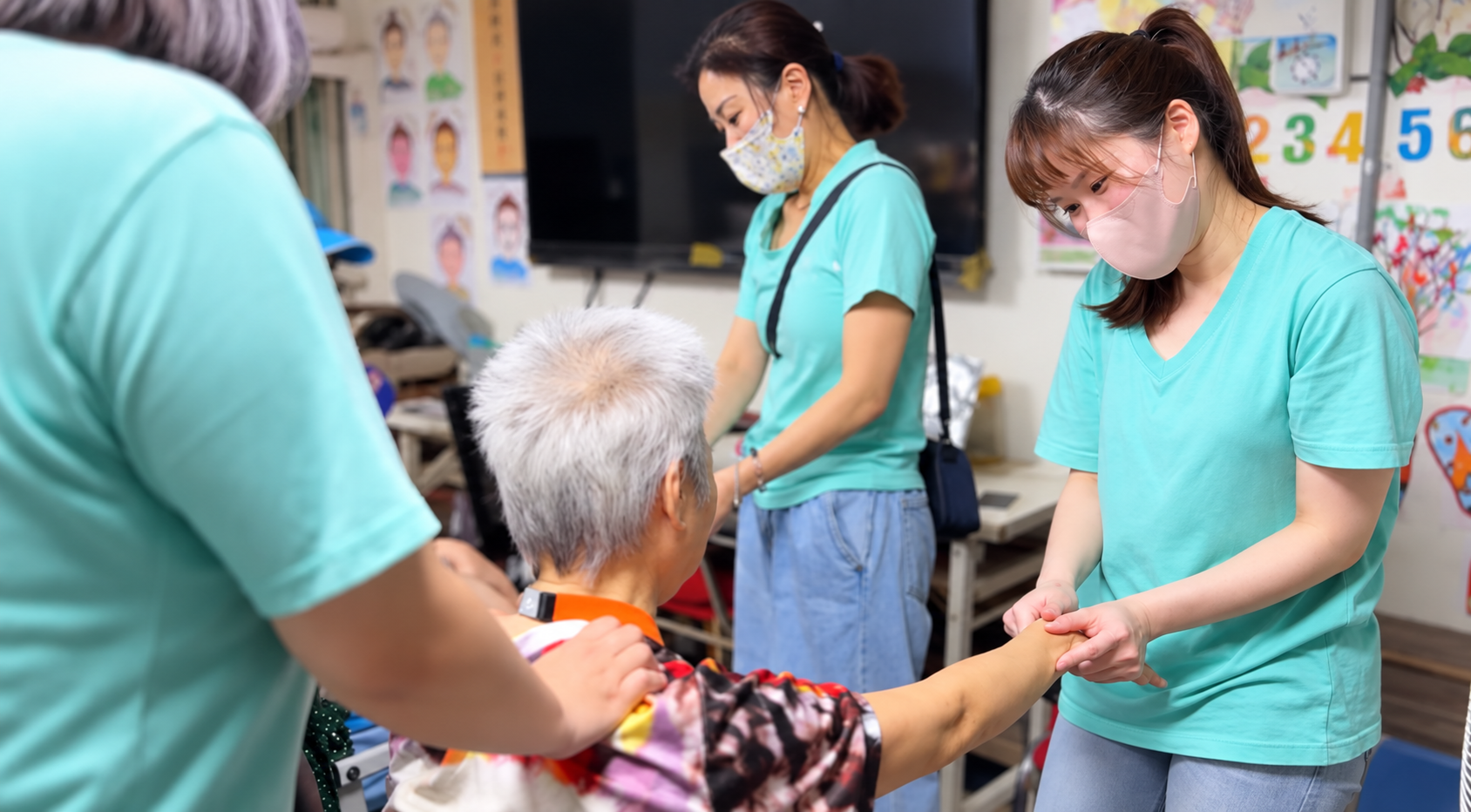
SKILLS · PEOPLE · SOCIAL IMPACT
讓每一種能力,
都有被看見的機會。
連結技能、人才、產業與社會,
讓學習不受年齡限制,讓專業成為改變的力量。
認識協會
→
SCROLL TO EXPLORE
/* =========================================================
RESET
========================================================= */
.cahtd-hero,
.cahtd-hero *{
box-sizing:border-box;
}
/* =========================================================
HERO
========================================================= */
.cahtd-hero{
position:relative;
/* 突破 WordPress 父層寬度 */
width:100vw;
max-width:none;
margin-left:calc(50% – 50vw);
margin-right:calc(50% – 50vw);
min-height:720px;
overflow:hidden;
display:flex;
align-items:center;
background:#426055;
font-family:
“Noto Sans TC",
“PingFang TC",
“Microsoft JhengHei",
Arial,
sans-serif;
}
/* =========================================================
BACKGROUND
========================================================= */
.cahtd-hero__bg{
position:absolute;
inset:0;
z-index:0;
}
.cahtd-hero__bg img{
display:block;
width:100%;
height:100%;
object-fit:cover;
/* 桌機背景位置 */
object-position:center center;
}
/* =========================================================
OVERLAY
========================================================= */
.cahtd-hero__overlay{
position:absolute;
inset:0;
z-index:1;
background:
linear-gradient(
90deg,
rgba(31,49,43,.93) 0%,
rgba(31,49,43,.82) 28%,
rgba(31,49,43,.60) 48%,
rgba(31,49,43,.28) 70%,
rgba(31,49,43,.08) 100%
);
}
/* =========================================================
INNER
========================================================= */
.cahtd-hero__inner{
position:relative;
z-index:2;
width:88%;
max-width:1360px;
margin:0 auto;
padding:110px 0;
}
/* =========================================================
CONTENT
========================================================= */
.cahtd-hero__content{
width:100%;
max-width:700px;
}
/* =========================================================
EYEBROW
========================================================= */
.cahtd-hero__eyebrow{
display:flex;
align-items:center;
gap:15px;
margin-bottom:22px;
color:rgba(255,255,255,.72);
font-size:11px;
font-weight:500;
line-height:1.5;
letter-spacing:.22em;
}
.cahtd-hero__line{
display:block;
width:35px;
height:1px;
flex:0 0 35px;
background:#e4d5af;
opacity:.75;
}
/* =========================================================
TITLE
========================================================= */
.cahtd-hero h1{
width:100%;
max-width:700px;
margin:0;
padding:0;
color:#ffffff;
font-size:clamp(42px,3.5vw,54px);
font-weight:300;
line-height:1.45;
letter-spacing:.03em;
}
.cahtd-hero h1 strong{
display:block;
margin-top:3px;
color:#e4d5af;
font-size:inherit;
font-weight:400;
line-height:inherit;
}
/* =========================================================
DESCRIPTION
========================================================= */
.cahtd-hero__content > p{
max-width:620px;
margin:26px 0 34px;
color:rgba(255,255,255,.84);
font-size:16px;
font-weight:400;
line-height:1.95;
letter-spacing:.025em;
}
/* =========================================================
BUTTON
========================================================= */
.cahtd-hero__btn{
display:inline-flex;
align-items:center;
justify-content:space-between;
min-width:168px;
gap:34px;
padding:15px 20px 15px 23px;
border:1px solid rgba(255,255,255,.60);
background:rgba(255,255,255,.03);
color:#ffffff !important;
text-decoration:none !important;
font-size:13px;
font-weight:500;
line-height:1;
letter-spacing:.12em;
transition:.3s ease;
}
.cahtd-hero__arrow{
font-family:Arial,sans-serif;
font-size:18px;
font-weight:300;
}
@media (hover:hover){
.cahtd-hero__btn:hover{
background:#ffffff;
border-color:#ffffff;
color:#426055 !important;
}
}
/* =========================================================
SCROLL
========================================================= */
.cahtd-hero__scroll{
position:absolute;
left:6%;
bottom:30px;
z-index:3;
display:flex;
align-items:center;
gap:16px;
}
.cahtd-hero__scroll span{
color:rgba(255,255,255,.42);
font-size:9px;
letter-spacing:.22em;
}
.cahtd-hero__scroll i{
display:block;
width:58px;
height:1px;
background:rgba(255,255,255,.28);
}
/* =========================================================
TABLET
========================================================= */
@media (max-width:1024px){
.cahtd-hero{
min-height:680px;
}
.cahtd-hero__inner{
width:88%;
padding:90px 0;
}
.cahtd-hero__content{
max-width:590px;
}
.cahtd-hero h1{
max-width:590px;
font-size:40px;
line-height:1.5;
}
.cahtd-hero__content > p{
max-width:530px;
font-size:15px;
}
}
/* =========================================================
MOBILE
========================================================= */
@media (max-width:767px){
.cahtd-hero{
width:100vw;
min-height:650px;
margin-left:calc(50% – 50vw);
margin-right:calc(50% – 50vw);
align-items:center;
}
/* ————————-
手機背景
————————- */
.cahtd-hero__bg img{
object-fit:cover;
/*
如果人物在圖片右側,
這裡可以調整 55% / 60% / 65%
*/
object-position:58% center;
}
/* ————————-
手機遮罩
————————- */
.cahtd-hero__overlay{
background:
linear-gradient(
90deg,
rgba(31,49,43,.91) 0%,
rgba(31,49,43,.78) 45%,
rgba(31,49,43,.48) 72%,
rgba(31,49,43,.20) 100%
);
}
/* ————————-
手機內容
————————- */
.cahtd-hero__inner{
width:100%;
margin:0;
padding:
90px
7%
75px;
}
.cahtd-hero__content{
width:100%;
max-width:420px;
}
/* ————————-
英文
————————- */
.cahtd-hero__eyebrow{
gap:10px;
margin-bottom:18px;
font-size:10px;
letter-spacing:.14em;
}
.cahtd-hero__line{
width:27px;
flex-basis:27px;
}
/* ————————-
主標
————————- */
.cahtd-hero h1{
max-width:390px;
font-size:35px;
line-height:1.5;
letter-spacing:.015em;
}
/* ————————-
介紹
————————- */
.cahtd-hero__content > p{
max-width:360px;
margin:20px 0 28px;
font-size:15px;
line-height:1.85;
}
.cahtd-hero__content > p br{
display:none;
}
/* ————————-
按鈕
————————- */
.cahtd-hero__btn{
min-width:158px;
padding:14px 18px 14px 21px;
gap:26px;
font-size:13px;
}
/* 手機不顯示 SCROLL */
.cahtd-hero__scroll{
display:none;
}
}
/* =========================================================
SMALL MOBILE
========================================================= */
@media (max-width:390px){
.cahtd-hero{
min-height:620px;
}
.cahtd-hero__inner{
padding:
80px
7%
65px;
}
.cahtd-hero h1{
max-width:340px;
font-size:31px;
}
.cahtd-hero__content > p{
max-width:325px;
font-size:15px;
}
}
ABOUT CAHTD
以技能,
點亮更多可能。
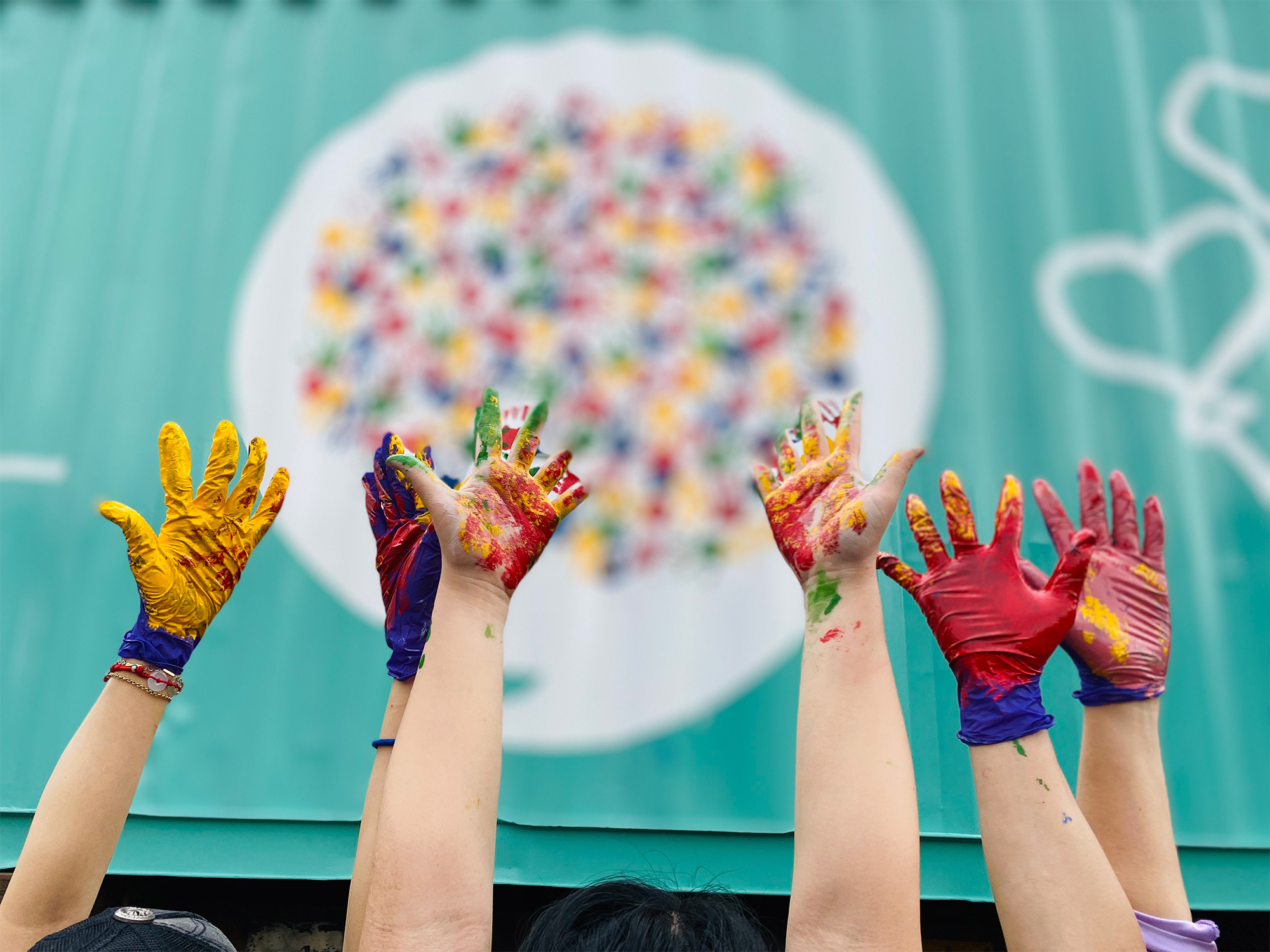
中華全技能發展協會以全齡、全人與多元技能發展為核心,
致力連結技能教育、產業實務、職涯發展與社會公益。
我們相信,能力不應被年齡、學歷、背景或既有職稱限制。
每個人都能透過合適的學習與實踐,找到自己的價值,
以及參與社會的方式。
了解更多
→
/* =========================================================
RESET
========================================================= */
.cahtd-about,
.cahtd-about *{
box-sizing:border-box;
}
/* =========================================================
SECTION
========================================================= */
.cahtd-about{
width:100%;
padding:120px 6%;
background:#ffffff;
font-family:
“Noto Sans TC",
“Microsoft JhengHei",
Arial,
sans-serif;
overflow:hidden;
}
/* =========================================================
MAIN LAYOUT
========================================================= */
.cahtd-about-wrap{
width:100%;
max-width:1180px;
margin:0 auto;
display:grid;
grid-template-columns:
minmax(0,.92fr)
minmax(0,1.08fr);
align-items:center;
gap:90px;
}
/* =========================================================
CONTENT
========================================================= */
.cahtd-about-content{
width:100%;
min-width:0;
}
/* =========================================================
ENGLISH LABEL
========================================================= */
.cahtd-about-en{
display:block;
color:#a38a57;
font-size:12px;
font-weight:500;
line-height:1.5;
letter-spacing:4px;
}
/* =========================================================
TITLE
========================================================= */
.cahtd-about h2{
margin:18px 0 0;
padding:0;
color:#426055;
font-size:44px;
font-weight:400;
line-height:1.4;
letter-spacing:1px;
}
.cahtd-about h2 span{
color:#8c7350;
font-weight:400;
}
/* =========================================================
DECORATION LINE
========================================================= */
.cahtd-about-line{
display:block;
width:45px;
height:1px;
margin:28px 0;
background:#b69a63;
}
/* =========================================================
TEXT
========================================================= */
.cahtd-about-text{
width:100%;
}
.cahtd-about-text p{
margin:0 0 18px;
padding:0;
color:#625e58;
font-size:16px;
font-weight:400;
line-height:2;
letter-spacing:.5px;
}
.cahtd-about-text p:last-child{
margin-bottom:0;
}
/* =========================================================
CTA
========================================================= */
.cahtd-about-link{
display:inline-flex;
align-items:center;
gap:20px;
margin-top:28px;
padding-bottom:7px;
color:#426055 !important;
font-size:14px;
font-weight:500;
line-height:1.5;
letter-spacing:1px;
text-decoration:none !important;
border-bottom:1px solid #426055;
transition:
gap .3s ease,
opacity .3s ease;
}
.cahtd-about-arrow{
font-size:18px;
line-height:1;
}
@media (hover:hover){
.cahtd-about-link:hover{
gap:28px;
opacity:.7;
}
}
/* =========================================================
DESKTOP IMAGE
========================================================= */
.cahtd-about-visual{
position:relative;
width:100%;
height:520px;
margin:0;
overflow:hidden;
}
.cahtd-about-visual img{
display:block;
width:100%;
height:100%;
object-fit:cover;
object-position:center center;
transition:transform .8s ease;
}
@media (hover:hover){
.cahtd-about-visual:hover img{
transform:scale(1.025);
}
}
/* =========================================================
MOBILE IMAGE
Desktop 預設隱藏
========================================================= */
.cahtd-about-mobile-visual{
display:none;
}
/* =========================================================
TABLET
768px – 1024px
========================================================= */
@media (min-width:768px) and (max-width:1024px){
.cahtd-about{
padding:90px 6%;
}
.cahtd-about-wrap{
grid-template-columns:
minmax(0,.95fr)
minmax(0,1.05fr);
gap:50px;
}
.cahtd-about h2{
font-size:38px;
}
.cahtd-about-text p{
font-size:15px;
line-height:1.9;
}
.cahtd-about-visual{
height:460px;
}
}
/* =========================================================
MOBILE
<= 767px
========================================================= */
@media (max-width:767px){
/* =========================
SECTION
========================== */
.cahtd-about{
padding:68px 0 74px;
}
.cahtd-about-wrap{
display:block;
width:100%;
max-width:none;
margin:0;
}
/* =========================
CONTENT
========================== */
.cahtd-about-content{
width:100%;
}
/* =========================
HEADING
========================== */
.cahtd-about-heading{
padding:0 24px;
}
/* 英文 */
.cahtd-about-en{
font-size:11px;
font-weight:500;
line-height:1.5;
letter-spacing:3.5px;
}
/* 標題 */
.cahtd-about h2{
margin:13px 0 0;
font-size:31px;
font-weight:400;
line-height:1.42;
letter-spacing:.4px;
}
/* 金線 */
.cahtd-about-line{
width:38px;
margin:21px 0 0;
}
/* =========================
MOBILE IMAGE
========================== */
.cahtd-about-mobile-visual{
display:block;
position:relative;
width:calc(100% – 32px);
height:auto;
aspect-ratio:1.28 / 1;
margin:
32px
0
0
32px;
overflow:hidden;
}
.cahtd-about-mobile-visual img{
display:block;
width:100%;
height:100%;
object-fit:cover;
object-position:center center;
}
/* =========================
DESKTOP IMAGE 隱藏
========================== */
.cahtd-about-visual{
display:none;
}
/* =========================
TEXT
========================== */
.cahtd-about-text{
padding:0 24px;
margin-top:32px;
}
.cahtd-about-text p{
margin:0 0 17px;
color:#625e58;
font-size:15px;
font-weight:400;
line-height:1.95;
letter-spacing:.2px;
}
.cahtd-about-text p:last-child{
margin-bottom:0;
}
/* =========================
CTA
========================== */
.cahtd-about-link{
margin:
25px
0
0
24px;
gap:17px;
padding-bottom:6px;
font-size:14px;
font-weight:500;
letter-spacing:1px;
}
.cahtd-about-arrow{
font-size:18px;
}
}
/* =========================================================
SMALL MOBILE
<= 420px
========================================================= */
@media (max-width:420px){
.cahtd-about{
padding:
60px
0
66px;
}
.cahtd-about-heading{
padding:
0
20px;
}
.cahtd-about h2{
font-size:29px;
line-height:1.45;
}
.cahtd-about-mobile-visual{
width:calc(100% – 24px);
margin:
28px
0
0
24px;
aspect-ratio:1.2 / 1;
}
.cahtd-about-text{
padding:
0
20px;
margin-top:29px;
}
.cahtd-about-text p{
font-size:15px;
line-height:1.9;
}
.cahtd-about-link{
margin:
24px
0
0
20px;
}
}
CHIEF ADVISOR
首席顧問

蔡憶雲
博士
PROFESSIONAL ADVISORY
從專業出發,
看見產業更長遠的可能。
長期深耕整體輔助療法、芳香療法與專業人才培育,
橫跨國際芳療專業、大專院校教學與 SPA 產業顧問實務。
從研究、教育到第一線應用,以跨領域的專業視角,
持續推動專業發展與人才培育。
中醫博士
國際芳療專業
大專院校教學
SPA 產業顧問
查看完整經歷
→
/* =========================================================
RESET
========================================================= */
.tsai-chief,
.tsai-chief *{
box-sizing:border-box;
}
/* =========================================================
SECTION
========================================================= */
.tsai-chief{
–green:#426055;
–white:#ffffff;
position:relative;
width:100%;
overflow:hidden;
padding:110px 6% 120px;
background:#426055;
font-family:
“Noto Sans TC",
“PingFang TC",
“Microsoft JhengHei",
sans-serif;
}
/* =========================================================
WRAP
========================================================= */
.tsai-chief-wrap{
width:min(1360px,100%);
margin:0 auto;
display:grid;
grid-template-columns:
minmax(0,1fr)
minmax(0,.95fr);
gap:clamp(80px,8vw,130px);
align-items:center;
}
/* =========================================================
VISUAL
========================================================= */
.tsai-chief-visual{
position:relative;
width:100%;
min-width:0;
}
/* =========================================================
LABEL
========================================================= */
.tsai-chief-label{
display:flex;
align-items:center;
gap:15px;
margin:
0
0
21px
7%;
}
.tsai-chief-label span{
font-size:13px !important;
font-weight:600;
line-height:1.4;
letter-spacing:.18em;
color:rgba(255,255,255,.55);
}
.tsai-chief-label i{
display:block;
width:30px;
height:1px;
flex:0 0 auto;
background:rgba(255,255,255,.35);
}
.tsai-chief-label strong{
font-size:17px !important;
font-weight:500;
line-height:1.4;
letter-spacing:.1em;
color:#fff;
}
/* =========================================================
PHOTO
========================================================= */
.tsai-chief-photo{
position:relative;
width:88%;
margin-left:7%;
}
/* 照片後方錯位層 */
.tsai-chief-photo::before{
content:"";
position:absolute;
z-index:0;
left:-25px;
bottom:-25px;
width:57%;
height:51%;
background:rgba(255,255,255,.09);
}
.tsai-chief-photo img{
position:relative;
z-index:1;
display:block;
width:100%;
aspect-ratio:4 / 5;
object-fit:cover;
object-position:center center;
}
/* =========================================================
NAME|照片重疊姓名
========================================================= */
.tsai-chief-name{
position:absolute;
z-index:5;
right:-65px;
bottom:46px;
min-width:285px;
padding:
18px
27px
20px;
background:rgba(255,255,255,.96);
box-shadow:
0 18px 48px
rgba(18,31,26,.15);
}
.tsai-chief-name::before{
content:"";
position:absolute;
left:0;
top:0;
width:4px;
height:100%;
background:#8da097;
}
.tsai-chief-name strong{
display:inline-block;
font-size:44px !important;
font-weight:500;
line-height:1.15;
letter-spacing:.055em;
color:#3f413e;
}
.tsai-chief-name span{
display:inline-block;
margin-left:9px;
font-size:18px !important;
font-weight:400;
line-height:1.3;
letter-spacing:.08em;
color:#77736d;
}
/* =========================================================
CONTENT
========================================================= */
.tsai-chief-content{
width:100%;
min-width:0;
max-width:610px;
}
/* =========================================================
ENGLISH
========================================================= */
.tsai-chief-en{
display:block;
margin-bottom:19px;
font-size:13px !important;
font-weight:600;
line-height:1.4;
letter-spacing:.2em;
color:rgba(255,255,255,.52);
}
/* =========================================================
TITLE
========================================================= */
.tsai-chief-content h2{
margin:0 !important;
padding:0 !important;
font-size:
clamp(30px,2.5vw,38px) !important;
font-weight:500 !important;
line-height:1.58 !important;
letter-spacing:.015em;
color:#fff !important;
}
.tsai-chief-content h2 span{
display:block;
color:#fff;
}
/* =========================================================
LINE
========================================================= */
.tsai-chief-line{
width:50px;
height:2px;
margin:
27px
0;
background:rgba(255,255,255,.65);
}
/* =========================================================
INTRO
========================================================= */
.tsai-chief-intro{
max-width:590px;
margin:0 !important;
padding:0 !important;
font-size:18px !important;
font-weight:400 !important;
line-height:1.9 !important;
letter-spacing:.01em;
color:rgba(255,255,255,.80) !important;
}
/* =========================================================
TAGS
========================================================= */
.tsai-chief-tags{
display:flex;
flex-wrap:wrap;
gap:
10px
24px;
margin-top:27px;
}
.tsai-chief-tags span{
position:relative;
padding-left:13px;
font-size:15px !important;
font-weight:500;
line-height:1.6;
letter-spacing:.02em;
color:rgba(255,255,255,.9);
}
.tsai-chief-tags span::before{
content:"";
position:absolute;
left:0;
top:10px;
width:4px;
height:4px;
border-radius:50%;
background:rgba(255,255,255,.6);
}
/* =========================================================
CTA
========================================================= */
.tsai-chief-more{
display:inline-flex;
align-items:center;
gap:35px;
margin-top:34px;
padding:
0
0
8px;
border-bottom:
1px solid
rgba(255,255,255,.5);
color:#fff !important;
text-decoration:none !important;
}
.tsai-chief-more span{
font-size:16px !important;
font-weight:500;
line-height:1.5;
letter-spacing:.03em;
}
.tsai-chief-more i{
font-size:20px !important;
font-style:normal;
line-height:1;
transition:transform .3s ease;
}
@media (hover:hover){
.tsai-chief-more:hover i{
transform:translateX(5px);
}
}
/* =========================================================
TABLET
768px – 1050px
平板不再維持左右兩欄
改成圖片 → 內容上下排列
========================================================= */
@media (min-width:768px) and (max-width:1050px){
.tsai-chief{
padding:
76px
7%
88px;
}
/* ————————-
WRAP
————————- */
.tsai-chief-wrap{
display:block;
width:min(820px,100%);
margin:0 auto;
}
/* ————————-
LABEL
————————- */
.tsai-chief-label{
margin:
0
0
20px
4%;
gap:13px;
}
.tsai-chief-label span{
font-size:12px !important;
}
.tsai-chief-label i{
width:27px;
}
.tsai-chief-label strong{
font-size:16px !important;
}
/* ————————-
PHOTO
————————- */
.tsai-chief-photo{
width:70%;
max-width:540px;
margin-left:4%;
}
.tsai-chief-photo::before{
left:-22px;
bottom:-21px;
width:55%;
height:45%;
}
.tsai-chief-photo img{
aspect-ratio:4 / 4.7;
object-position:center 22%;
}
/* ————————-
NAME
仍然重疊
但不會超出頁面
————————- */
.tsai-chief-name{
right:-82px;
bottom:34px;
min-width:250px;
padding:
16px
23px
18px;
}
.tsai-chief-name strong{
font-size:37px !important;
}
.tsai-chief-name span{
margin-left:7px;
font-size:16px !important;
}
/* ————————-
CONTENT
————————- */
.tsai-chief-content{
width:90%;
max-width:680px;
margin:
82px
0
0
4%;
}
.tsai-chief-en{
margin-bottom:16px;
font-size:12px !important;
}
.tsai-chief-content h2{
max-width:620px;
font-size:30px !important;
line-height:1.55 !important;
}
.tsai-chief-line{
width:46px;
margin:
24px
0;
}
.tsai-chief-intro{
max-width:680px;
font-size:17px !important;
line-height:1.9 !important;
}
.tsai-chief-tags{
gap:
9px
22px;
margin-top:24px;
}
.tsai-chief-tags span{
font-size:15px !important;
}
.tsai-chief-more{
margin-top:30px;
}
.tsai-chief-more span{
font-size:15px !important;
}
}
/* =========================================================
MOBILE
<= 767px
========================================================= */
@media (max-width:767px){
.tsai-chief{
padding:
52px
20px
62px;
}
.tsai-chief-wrap{
display:block;
width:100%;
}
/* =====================================================
LABEL
====================================================== */
.tsai-chief-label{
margin:
0
0
17px;
gap:10px;
}
.tsai-chief-label span{
font-size:10px !important;
letter-spacing:.15em;
}
.tsai-chief-label i{
width:21px;
}
.tsai-chief-label strong{
font-size:14px !important;
letter-spacing:.08em;
}
/* =====================================================
PHOTO
====================================================== */
.tsai-chief-photo{
width:calc(100% – 20px);
margin-left:20px;
}
.tsai-chief-photo::before{
left:-20px;
bottom:-16px;
width:58%;
height:42%;
}
.tsai-chief-photo img{
aspect-ratio:1 / 1.02;
object-position:center 24%;
}
/* =====================================================
NAME OVERLAP
====================================================== */
.tsai-chief-name{
right:auto;
left:-20px;
bottom:-24px;
min-width:0;
padding:
13px
19px
14px
17px;
box-shadow:
0 12px 28px
rgba(17,31,25,.16);
}
.tsai-chief-name::before{
width:3px;
}
.tsai-chief-name strong{
font-size:33px !important;
}
.tsai-chief-name span{
margin-left:6px;
font-size:15px !important;
}
/* =====================================================
CONTENT
====================================================== */
.tsai-chief-content{
width:100%;
max-width:none;
margin:0;
padding-top:61px;
}
/* 手機不重複英文 */
.tsai-chief-en{
display:none;
}
/* =====================================================
TITLE
====================================================== */
.tsai-chief-content h2{
font-size:23px !important;
line-height:1.6 !important;
}
/* =====================================================
LINE
====================================================== */
.tsai-chief-line{
width:40px;
height:1px;
margin:
20px
0;
background:rgba(255,255,255,.55);
}
/* =====================================================
INTRO
====================================================== */
.tsai-chief-intro{
font-size:16px !important;
line-height:1.9 !important;
}
/* =====================================================
TAGS
====================================================== */
.tsai-chief-tags{
display:flex;
flex-wrap:wrap;
gap:
7px
17px;
margin-top:22px;
}
.tsai-chief-tags span{
padding-left:10px;
font-size:14px !important;
line-height:1.6;
}
.tsai-chief-tags span::before{
top:9px;
width:3px;
height:3px;
}
/* =====================================================
CTA
====================================================== */
.tsai-chief-more{
gap:26px;
margin-top:27px;
padding-bottom:7px;
}
.tsai-chief-more span{
font-size:15px !important;
}
.tsai-chief-more i{
font-size:18px !important;
}
}
/* =========================================================
SMALL MOBILE
<= 390px
========================================================= */
@media (max-width:390px){
.tsai-chief{
padding:
48px
17px
58px;
}
.tsai-chief-photo{
width:calc(100% – 17px);
margin-left:17px;
}
.tsai-chief-name{
left:-17px;
}
.tsai-chief-name strong{
font-size:31px !important;
}
.tsai-chief-name span{
font-size:14px !important;
}
.tsai-chief-content{
padding-top:58px;
}
.tsai-chief-content h2{
font-size:22px !important;
}
.tsai-chief-intro{
font-size:16px !important;
}
.tsai-chief-tags{
gap:
6px
14px;
}
.tsai-chief-tags span{
font-size:13px !important;
}
}
.cahtd-what,
.cahtd-what *{
box-sizing:border-box;
}
.cahtd-what{
width:100%;
padding:120px 6%;
overflow:hidden;
background:#fff;
font-family:"Noto Sans TC","PingFang TC","Microsoft JhengHei",Arial,sans-serif;
}
.cahtd-what-wrap{
width:min(1320px,100%);
margin:auto;
display:grid;
grid-template-columns:minmax(300px,.72fr) minmax(0,1.28fr);
gap:clamp(70px,8vw,125px);
align-items:center;
}
/* LEFT */
.cahtd-what-head{
min-width:0;
}
.cahtd-what-en{
position:relative;
display:block;
margin-bottom:22px;
padding-left:46px;
color:#a38a57;
font-size:12px;
font-weight:600;
letter-spacing:.22em;
}
.cahtd-what-en:before{
content:"";
position:absolute;
left:0;
top:50%;
width:31px;
height:1px;
background:#a38a57;
}
.cahtd-what-title{
margin:0;
color:#42433f;
font-size:clamp(38px,3.5vw,52px);
font-weight:400;
line-height:1.45;
letter-spacing:.02em;
}
.cahtd-what-title span{
color:#426055;
}
.cahtd-what-desc{
max-width:400px;
margin:26px 0 0;
color:#6f6d67;
font-size:17px;
line-height:1.9;
}
.cahtd-what-mark{
display:flex;
align-items:center;
gap:14px;
margin-top:38px;
color:#aaa49b;
font-size:10px;
letter-spacing:.15em;
}
.cahtd-what-mark:before{
content:"";
width:52px;
height:1px;
background:#c8c3b9;
}
/* CARDS */
.cahtd-what-grid{
display:grid;
grid-template-columns:repeat(2,minmax(0,1fr));
gap:14px;
}
.cahtd-card{
position:relative;
min-height:345px;
display:flex;
align-items:flex-end;
padding:44px 40px 38px;
overflow:hidden;
}
.cahtd-card.light{
background:#f4f0e8;
}
.cahtd-card.green{
background:#426055;
}
.cahtd-card.deep{
background:#354f46;
}
.cahtd-card.first{
transform:translateY(34px);
}
.cahtd-card.last{
transform:translateY(-34px);
}
.cahtd-card-num{
position:absolute;
top:8px;
right:22px;
font-family:Georgia,"Times New Roman",serif;
font-size:90px;
line-height:1;
letter-spacing:-.05em;
}
.light .cahtd-card-num{
color:rgba(66,96,85,.08);
}
.green .cahtd-card-num,
.deep .cahtd-card-num{
color:rgba(255,255,255,.09);
}
.cahtd-card-body{
position:relative;
z-index:2;
max-width:295px;
}
.cahtd-card-en{
display:block;
margin-bottom:10px;
font-size:10px;
font-weight:600;
line-height:1.5;
letter-spacing:.17em;
}
.cahtd-card-title{
margin:0 0 14px;
font-size:27px;
font-weight:500;
line-height:1.4;
letter-spacing:.04em;
}
.cahtd-card-text{
margin:0;
font-size:15px;
line-height:1.9;
}
.light .cahtd-card-en{
color:#9e8964;
}
.light .cahtd-card-title{
color:#426055;
}
.light .cahtd-card-text{
color:#716f69;
}
.green .cahtd-card-en,
.deep .cahtd-card-en{
color:rgba(255,255,255,.55);
}
.green .cahtd-card-title,
.deep .cahtd-card-title{
color:#fff;
}
.green .cahtd-card-text,
.deep .cahtd-card-text{
color:rgba(255,255,255,.8);
}
/* TABLET */
@media (min-width:768px) and (max-width:1050px){
.cahtd-what{
padding:85px 6% 105px;
}
.cahtd-what-wrap{
display:block;
width:min(820px,100%);
}
.cahtd-what-head{
max-width:650px;
margin-bottom:58px;
}
.cahtd-what-title{
font-size:40px;
}
.cahtd-what-desc{
max-width:520px;
font-size:16px;
}
.cahtd-card{
min-height:300px;
padding:38px 32px 33px;
}
.cahtd-card.first{
transform:translateY(20px);
}
.cahtd-card.last{
transform:translateY(-20px);
}
.cahtd-card-num{
font-size:74px;
}
.cahtd-card-title{
font-size:25px;
}
}
/* MOBILE */
@media (max-width:767px){
.cahtd-what{
padding:66px 0 72px;
}
.cahtd-what-wrap{
display:block;
width:100%;
}
.cahtd-what-head{
padding:0 24px;
margin-bottom:42px;
}
.cahtd-what-en{
margin-bottom:16px;
padding-left:39px;
font-size:11px;
}
.cahtd-what-en:before{
width:26px;
}
.cahtd-what-title{
font-size:31px;
line-height:1.48;
}
.cahtd-what-desc{
max-width:350px;
margin-top:18px;
font-size:16px;
line-height:1.85;
}
.cahtd-what-mark{
display:none;
}
.cahtd-what-grid{
display:flex;
flex-direction:column;
gap:12px;
}
.cahtd-card{
width:90%;
min-height:260px;
padding:66px 28px 29px;
transform:none;
}
.cahtd-card:nth-child(odd){
align-self:flex-start;
}
.cahtd-card:nth-child(even){
align-self:flex-end;
}
.cahtd-card.mobile-light{
background:#f4f0e8;
}
.cahtd-card.mobile-dark{
background:#354f46;
}
.mobile-light .cahtd-card-num{
color:rgba(66,96,85,.09);
}
.mobile-light .cahtd-card-en{
color:#9e8964;
}
.mobile-light .cahtd-card-title{
color:#426055;
}
.mobile-light .cahtd-card-text{
color:#716f69;
}
.mobile-dark .cahtd-card-num{
color:rgba(255,255,255,.1);
}
.mobile-dark .cahtd-card-en{
color:rgba(255,255,255,.55);
}
.mobile-dark .cahtd-card-title{
color:#fff;
}
.mobile-dark .cahtd-card-text{
color:rgba(255,255,255,.82);
}
.cahtd-card-num{
top:10px;
right:19px;
font-size:64px;
}
.cahtd-card-body{
max-width:300px;
}
.cahtd-card-title{
margin-bottom:12px;
font-size:25px;
}
.cahtd-card-text{
font-size:15px;
line-height:1.85;
}
}
/* SMALL MOBILE */
@media (max-width:420px){
.cahtd-what{
padding:58px 0 65px;
}
.cahtd-what-head{
padding:0 20px;
margin-bottom:36px;
}
.cahtd-what-title{
font-size:29px;
}
.cahtd-what-desc{
font-size:15px;
}
.cahtd-card{
width:91%;
min-height:245px;
padding:62px 24px 26px;
}
.cahtd-card-num{
font-size:58px;
}
.cahtd-card-title{
font-size:24px;
}
}
WHAT WE DO
讓技能,
成為改變的起點。
從學習到實踐,從個人成長到社會參與,
讓專業不只被學會,也能真正產生影響。
LEARN · PRACTICE · IMPACT
01
LIFELONG LEARNING
終身學習
推動全齡學習與多元技能發展,
讓每個生命階段都有重新學習、
持續成長的機會。
02
SKILL DEVELOPMENT
技能發展
連結專業知識與實務經驗,
讓能力真正能被學習、實踐,
並回到真實場域中運用。
03
SOCIAL CONNECTION
社會連結
串聯產業、教育、企業與社群,
打開跨領域交流與合作,
讓不同專業彼此連結。
04
COMMUNITY IMPACT
公益行動
鼓勵專業投入社區與公益服務,
讓所學重新回到社會,
成為持續發生的正向力量。
PROFESSIONAL FIELDS
跨越領域,
讓能力持續生長。
從專業技能、職涯發展到社會參與,
建立更多元的學習與實踐機會。
01
健康促進與身心平衡
WELLNESS & HOLISTIC CARE
02
美容・芳療・SPA 實務
BEAUTY · AROMATHERAPY · SPA
03
熟齡與全齡生活技能
ACTIVE AGING & LIFE SKILLS
04
女性職涯與創業賦能
CAREER & ENTREPRENEURSHIP
05
職能培育與第二專長
WORKFORCE & SECOND CAREER
06
講師培育與知識傳承
TRAIN-THE-TRAINER
07
公益服務與社區參與
PUBLIC WELFARE & COMMUNITY
08
跨域及國際交流
CROSS-SECTOR & GLOBAL EXCHANGE
SOCIAL IMPACT
專業可以改變一個人,
也可以溫暖一個社會。
我們鼓勵專業人才走進社區、參與公益,
將所學轉化為實際服務,
讓技能不只成就自己,也能成為支持他人的力量。
看見我們的公益行動
→
PARTNERSHIP
讓不同專業,在這裡相遇。
串聯產業、教育、企業、社群與公益夥伴,
建立跨域合作與資源共享的平台,
讓更多好的專業被看見,也讓更多需要被回應。
產業合作
教育交流
企業連結
社區服務
公益合作
國際交流
合作洽詢
→
TOGETHER, WE CREATE IMPACT
每一份能力,
都可能成為改變的開始。
加入我們,讓專業被看見、被實踐,
也讓更多美好的力量持續發生。